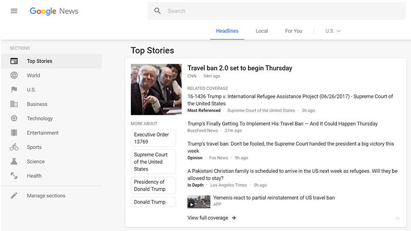
Google has unveiled a new look for the desktop version of its news reader platform, Google News, in an effort to improve readability, navigation, and include different perspectives. The update has also brought it in line with Google’s Material Design visual aesthetic, which relies heavily on cards. Unlike before, every story gets its own rectangle that helps de-clutter the interface, with a slightly bigger square picture to go with it.
The new homepage has three sections at the top: world headlines, local news, and a “For You” tab that only shows the stuff you care about. The latter two can be personalised once you log in with your Google account; local can be focused on any part of the world, while “For You” is like a social news feed of sorts. Google will also help include more perspectives once you click on a story card, bringing in other pieces that might carry labels such as “Most Referenced”, “Opinion”, “Live Updating”, or “Fact Check”.
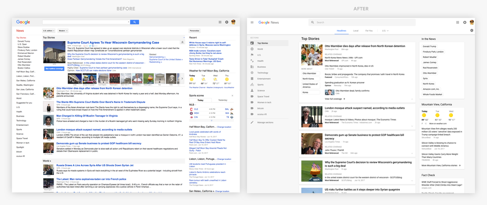
The last of those labels was introduced just last year, and it’s now getting its own box on the new Google News homepage. Available to the right-hand side of the headlines, it’ll show the top fact checked articles that were published recently. Unfortunately for now, the feature is limited to the US edition.
There’s also a new “Full Coverage” page – accessible from the story card – which sorts different types of articles into sections, and includes videos and related topics on the right. The new design is being rolled out over the coming days, so don’t fret if you don’t see it just yet.
[“Source-ndtv”]